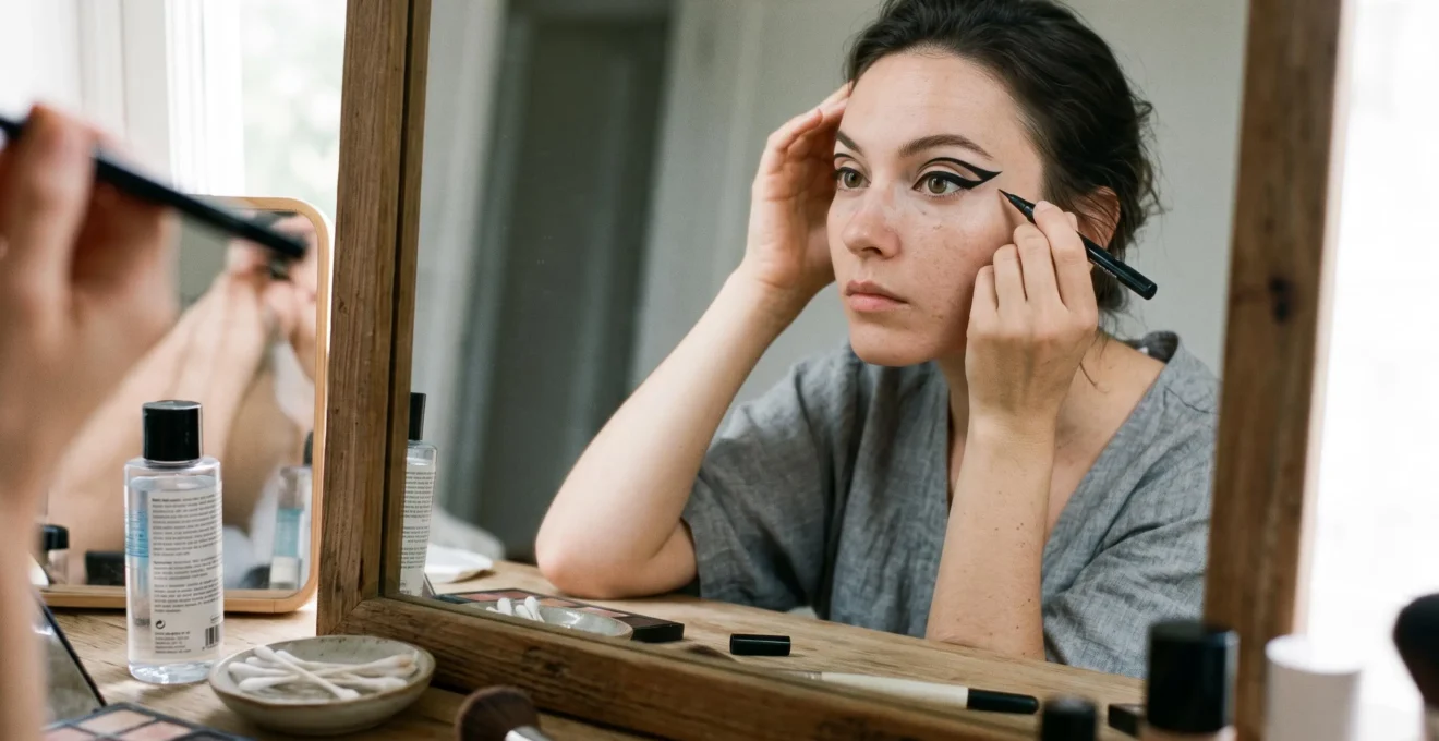
Graphic eyeliner can look perfectly sharp in your bathroom mirror and lose its shape before you reach your destination. A wing transfers onto your upper crease, one side looks heavier than the other, or an elaborate floating line disappears when you open your eyes.
The solution starts before the eyeliner touches your skin. To give graphic eyeliner the best chance of staying crisp for six hours, prepare the eyelids with thin layers, map the design with your eyes open, choose a formula suited to your skin and eye shape, and let each stroke set before checking for transfer. The result depends on friction, oiliness, humidity, application thickness, and the particular formula; no technique can guarantee six hours without smudging.
You do not need identical eyelids, an extensive brush collection, or perfect freehand drawing. You need visible reference points, a design that works with your natural folds, and a correction method that preserves the edges you have already created.
Graphic Eyeliner: The Essentials for Crisp, Longer-Lasting Wear
- Map with your eyes open: place your lines where they remain visible in your natural, relaxed expression.
- Match the formula to the problem: long-wearing products can help with oil-related smudging, while changing placement can reduce contact-related transfer.
- Work in controlled stages: curl lashes first, sketch the shape lightly, refine one edge at a time, and allow the eyeliner to dry before your final check.
- Why Does Graphic Eyeliner Smudge on Hooded Lids Within 30 Minutes Even With Primer?
- How to Map Graphic Eyeliner With 2 Anchor Points So Both Eyes Match Without Redrawing
- Which Is Better for Graphic Eyeliner: Gel Pot, Liquid Pen, or Cake Liner for Beginners?
- The Placement Mistake That Makes Graphic Eyeliner Look Broken When You Open Your Eyes
- When Should You Do Graphic Eyeliner in Your Routine So It Doesn’t Ruin the Rest of Your Makeup?
- How to Make Makeup Look Like Skin Using Thin Layers and 2 Blending Checks
- How to Test a Makeup Trend With 3 Questions Before You Commit in Public
- Which Graphic Eyeliner Styles Are Low-Risk to Try Without a Long Learning Curve?
Why Does Graphic Eyeliner Smudge on Hooded Lids Within 30 Minutes Even With Primer?
Graphic eyeliner can smudge on hooded lids within 30 minutes because the eyelid fold repeatedly touches the liner when the eyes open, blink, and move. Primer may improve product adhesion, but it cannot eliminate that physical contact. Oily skin, incomplete drying, and unsuitable formulas can make the problem worse. Identifying the type of smudging is more useful than automatically adding another layer of primer.
On a hooded eye, part of the upper eyelid folds over the mobile lid. A sharp line drawn across that contact area may touch another skin surface throughout the day. If the product has not fully set, pigment can transfer upward and leave a second, unwanted mark.
Two different problems can produce a similar messy result:
- Oil-related breakdown: the line loses definition, feathers, or spreads where skin oils or other products interfere with its wear.
- Mechanical transfer: a recognizable impression of the line appears on another part of the eyelid after the two surfaces touch.
The distinction matters because the remedies are different. For oil-related smudging, start with clean, dry lids, use a compatible eye primer if needed, and consider a long-wearing or waterproof formula. Where appropriate, a small amount of matching powder eyeshadow can help set a creamy liner, although it may soften an ultra-sharp graphic edge.
For mechanical transfer, reconsider the line’s position. Move the vulnerable segment away from the fold’s main contact area, or redesign the shape so the visible graphic element follows the open eye’s anatomy.
Allure’s tips for avoiding smudged eye makeup discuss clean eyelids, primers, waterproof products, and setting creamy textures. These are practical recommendations, not a controlled test proving a particular wear duration.
A simple at-home diagnostic can help you observe the problem. Apply a small amount of your chosen eyeliner, let it dry as directed, then check its appearance after approximately 10 minutes of normal blinking. Compare the original line with any new marks on the crease.
A sharply repeated mark suggests contact transfer; diffuse feathering may suggest product breakdown. Both can occur together, so this observation is a troubleshooting exercise rather than a validated diagnostic test. Keeping your eyes closed for the entire interval would not reproduce the contact caused by blinking.
Once you know where the eyeliner moves, you can plan a shape that avoids the problem instead of repeatedly repairing it. That begins with reliable landmarks on both eyes.
How to Map Graphic Eyeliner With 2 Anchor Points So Both Eyes Match Without Redrawing
To map graphic eyeliner with two anchor points, first mark where the line begins near the inner lash line or chosen design starting point. Then mark its outer endpoint using the outer eye corner and brow tail as visual guides. Connect the marks with your eyes open and relaxed, checking the overall appearance before filling or thickening the shape.
These anchors provide a repeatable reference, but they do not guarantee perfect symmetry. Natural differences between eye shapes, brow positions, and lid folds mean that visually balanced eyeliner may require slightly different lines on each side.
Anchor one: the starting point. For a connected graphic wing, choose a point near the inner corner or along the upper lash line. Keep its distance from the lash roots consistent with the design. For a floating line, choose the corresponding visible position above the crease instead.
Anchor two: the outer endpoint. Look straight ahead and identify the direction from the outer eye corner toward the brow tail. This provides a useful diagonal reference, not a rigid angle every eye must follow.
Mark both endpoints with small, light strokes. Then connect the two positions in short segments, keeping the skin relaxed. Pulling the eyelid taut may make drawing temporarily easier but can distort the finished shape when the skin returns to its natural position.
If one eye is consistently harder to draw, start with that eye while your hand is fresh and your attention is highest. Match the second eye to the first by comparing the visible endpoint, angle, and line thickness. This is a practical strategy, not evidence that one eye is universally more difficult because of hand dominance.
Makeup artists also use preliminary shadow outlines to test a shape. Allure’s makeup artist tutorial for cat-eye eyeliner describes adapting wings to eye shape, keeping the eye relaxed, and refining small mistakes locally.
Before committing to darker pigment, take a straight-on photograph with your head level and both eyes open. A phone image offers a second viewpoint that may make differences in wing height, thickness, or direction easier to notice. It is not inherently more accurate than a mirror, especially if the camera is close enough to distort perspective.
When the wings do not match, use a correction hierarchy: check the endpoints first, compare the angles next, and adjust thickness last. Correct the smallest area possible. Avoid removing both wings unless the underlying placement is clearly unsuitable.
Your 5-Step Graphic Eyeliner Symmetry Checklist
- Relax both eyes and identify the starting position of each design. Check that both starting points are visibly comparable.
- Mark the two outer endpoints using your eye corners and brow tails. Confirm their apparent height while looking straight ahead.
- Draw the more difficult eye in short strokes, then repeat the design on the other eye. Check that both outlines have a deliberate, recognizable shape.
- Take a straight-on photo with both eyes open. Identify the single most noticeable mismatch in height, angle, or thickness.
- Correct that mismatch with a fine brush or pointed swab, then take a final look at both eyes. The finished check is two visually balanced outlines with clean edges.
The aim is visual harmony rather than mathematically identical marks. Once your outline works, the next decision is which eyeliner texture will let you finish it with the least unnecessary correction.
Which Is Better for Graphic Eyeliner: Gel Pot, Liquid Pen, or Cake Liner for Beginners?
A felt-tip liquid pen is a practical starting point for beginners who want defined graphic wings with minimal tools. A gel pot may suit someone who prefers brush control and more opportunity to adjust a line before it sets. Cake liner offers flexible, brush-led application, but its wear depends strongly on the formula and how it is activated.
The most useful comparison is not simply which product creates the darkest line. Look at two variables: how cleanly you can produce the edge and how much time you have to correct it.
The following comparison describes typical application characteristics rather than a universal performance ranking. Actual results vary with the applicator, formula, skin texture, and technique.
| Criterion | Liquid Pen | Gel Pot | Cake Liner |
|---|---|---|---|
| Edge definition | Often crisp with a firm felt tip | Depends on brush shape and product consistency | Can be precise with a well-controlled fine brush |
| Correction tolerance | Often limited after setting | May remain adjustable briefly | Varies with activation and drying |
| Application control | Integrated applicator | Separate angled or fine brush | Separate brush and water activation |
| Beginner challenge | Pressure and steady strokes | Brush loading and line consistency | Water balance and brush control |
| Long-wear consideration | Choose a tested long-wearing formula | Check setting and water resistance | Check whether the formula resists water and transfer |
A liquid pen can create a thin, sharply defined edge without requiring you to load a separate brush. However, a fast-setting formula gives you less flexibility if the wing needs adjustment. Felt tips can also behave differently on textured or folded skin than more flexible brush tips.
A gel pot offers greater choice over the applicator. Use a short angled brush for controlled edges or a fine brush for smaller curves. Some formulas allow corrections before drying, but a non-waterproof gel may not be the most suitable choice for oily or frequently folding eyelids.
Cake liner is commonly activated with water and applied using a separate brush. Its consistency can be adjusted during preparation, which makes it appealing for artistic shapes. That does not automatically mean it has the longest working time or the strongest resistance to moisture. Traditional water-activated formulas may be easier to disturb with tears, rain, or perspiration.
Allure’s guide to different eyeliner types explains how gel pots, felt-tip liners, and brush-tip liquids differ in control, placement, and application. It does not establish a standardized ranking for edge sharpness or six-hour wear.
For a first graphic look, choose a pen if speed and a self-contained applicator matter most. Choose gel if you enjoy working with brushes and want to build precision gradually. Consider cake liner for creative practice when you can accommodate its particular durability limitations.
Even an excellent formula cannot rescue a design placed where the eyelid hides or interrupts it. The next challenge is making the shape work when your eyes are actually open.
The Placement Mistake That Makes Graphic Eyeliner Look Broken When You Open Your Eyes
The most common placement mistake is designing graphic eyeliner entirely with the eyes closed. A continuous line can appear interrupted when the eyelid opens because the crease changes which sections of skin remain visible. The solution is to design the visible shape with the eyes open, then use the closed-eye position only to refine the necessary connections.
Think of the relaxed, open eye as your primary canvas. This is the version of your makeup other people usually see, and it should guide the design’s height, direction, and overall proportions.
Begin with the eye open and looking straight ahead. Lightly mark the visible path you want the eyeliner to follow. Check whether any intended segment disappears beneath a fold. If it does, move the mark or alter the connection rather than automatically drawing a thicker line in the same place.
Different eyelid structures call for different approaches:
- Hooded lids: map around the fold while the eye is open. A visible wing may need an adjusted angle, a modified connection, or more apparent height. Not every graphic element must sit entirely above the fold.
- Monolids: establish the visible height deliberately, since a pronounced crease may not provide a placement reference. Check that the shape remains balanced when looking straight ahead.
- Deep-set eyes: consider the available visible lid area and the relationship between the crease and brow bone. Avoid placing details where shadows or surrounding skin obscure them.
Professional makeup artist Katie Jane Hughes‘s batwing approach illustrates this principle particularly well. On hooded eyes, the design may look curved or unconventional with the eye closed but form a deliberate, continuous-looking wing once the eye opens.
The technique is documented in Katie Jane Hughes’s hooded-eye eyeliner tutorial in Allure. The tutorial shows a shape adapted to eyelid anatomy, not a proven method for preventing all transfer or guaranteeing six-hour wear.
There is also a sizing issue. A tiny negative-space detail may look intricate on a closed lid but become visually disconnected once part of the eyelid folds away. Increasing its visible height or simplifying the negative space can make the design read more clearly.
Scaling up does not necessarily mean making the entire wing heavier. Sometimes moving one segment a little higher or changing the connection angle is enough.
After establishing the outline, close the eye briefly to connect visible sections where necessary. Reopen it without lifting your brows and check the result. If the design only looks correct while your forehead is raised, reassess its placement in your normal expression.
Once placement is resolved, application order becomes the next way to protect your work. A well-drawn line can still be disturbed by a lash curler, concealer cleanup, or finishing products.
When Should You Do Graphic Eyeliner in Your Routine So It Doesn’t Ruin the Rest of Your Makeup?
Graphic eyeliner is often easiest to manage after preparing the skin and brows and curling the lashes, but before mascara and final finishing steps. This sequence keeps the lid accessible and reduces the risk of a lash curler disturbing a completed wing. The exact order can change if your eyeliner requires extensive corrections or your complexion makeup is particularly delicate.
There is a practical middle ground between drawing eyeliner on completely bare skin and making it the last step after every powder and setting product.
Start with a clean eye area and apply any necessary complexion products in thin layers. Prepare your brows, then curl your lashes before applying eyeliner. For a precise graphic design, complete the light mapping first, add the liner, and leave mascara until the graphic edges have set.
Lash curling deserves special attention. Positioning a curler against a finished wing can press on or disturb its edge. Curling first avoids that particular risk. However, it is a sensible technique rather than a universal rule proving that every alternative application sequence causes damage.
For cleanup, keep a pointed cotton swab and a small amount of eye-safe makeup remover nearby. Work on the specific edge that needs correction rather than wiping across the whole lid. Use minimal remover, avoid the waterline and eye itself, and allow the area to dry before reapplying product.
If your graphic eyeliner is especially elaborate, an eye-first routine may be more convenient. You can complete and clean the design before applying foundation or under-eye concealer. Conversely, when the wing requires only a small extension, finishing the complexion first may work well.
Application timing also affects how much time the finished liner spends in contact with moving skin before you leave. Applying it closer to departure may be convenient, but doing so does not reset product wear or guarantee a longer-lasting finish.
More important than the clock is allowing the eyeliner to dry according to its formula. Avoid immediately pressing the lids together, adding mascara over wet edges, or applying another layer before the previous one has stabilized.
A tidy sequence protects the work you have done. Keeping the skin around the graphic liner light and natural helps preserve the visual sharpness of the finished design.
How to Make Makeup Look Like Skin Using Thin Layers and 2 Blending Checks
To make makeup look like skin around graphic eyeliner, use thin, controlled layers of concealer and base products rather than building coverage immediately. Check the finish first while looking straight ahead, then while squinting or smiling naturally. These two checks help reveal visible product buildup and areas where makeup collects in skin folds before they distract from the eyeliner.
Graphic eyeliner depends on contrast. A crisp black line appears more intentional when the surrounding skin looks smooth without appearing heavily coated. Thick or uneven complexion products can draw attention to texture near the design, even when the eyeliner itself is sharply applied.
Begin with the minimum product needed to even out the area. Add concealer only where additional coverage is useful, blending the edges so the transition between covered and uncovered skin remains subtle.
On the eyelid itself, avoid piling multiple creamy layers underneath a liner without checking their compatibility. Products that stay mobile can interfere with adhesion or contribute to unwanted movement.
The first blending check is a straight-on photo check. Take a photograph in consistent, natural-looking light with both eyes open. Look for obvious borders around concealer, visible patches, or excess product that competes with the eyeliner. A photograph is simply an additional visual perspective, not a definitive measurement of blending quality.
The second is a squint-and-smile check. Make a few normal facial expressions and notice where concealer naturally gathers. If product collects in a crease, remove or soften the excess rather than covering it with another thick layer.
For a more controlled finish, check the skin at normal viewing distance as well as close to the mirror. A tiny area of texture that appears prominent under magnification may be barely noticeable in everyday conversation.
This matters particularly for negative-space graphic eyeliner, where the design deliberately leaves an area of skin uncovered. Heavy base makeup inside that space can change the contrast between the liner and its surrounding skin.
Keep corrections local. If you use remover to sharpen the wing, restore only the affected area of concealer after the skin is clean and dry. Avoid spreading fresh base over the eyeliner edge.
The finishing goal is not an artificially texture-free eyelid. It is an even, comfortable base that allows the liner to remain the focal point. Once the base and eyeliner work together, test whether your chosen style fits the conditions of an ordinary day.
How to Test a Makeup Trend With 3 Questions Before You Commit in Public
Before wearing a new graphic eyeliner trend in public, test it against three questions: does the design remain visible on your natural eye shape, can you reproduce it within your available makeup time, and does it hold up under the conditions you expect to encounter? A practice session followed by a realistic wear test is more informative than judging the look immediately after application.
Creative eyeliner trends can be visually appealing without being equally practical for every face or routine. Floating lines, double wings, and negative-space designs introduce different demands on precision, placement, and product behavior.
The first question is: Does this shape suit my visible lid space?
Draw the design lightly with your eyes open. Look straight ahead and turn your head slightly in both directions. Check whether important details remain visible or disappear into the fold. A design that looks striking in a closed-eye reference photograph may need adaptation before it works on your own eyes.
The second question is: Can I reproduce it in the time I actually have?
Time one complete practice attempt, including mapping and corrections. If a style repeatedly requires extensive removal and redrawing, simplify it or reserve it for occasions when you have more time. The useful result is your own repeatable application time, not an assumed universal beginner benchmark.
The third question is: Will it survive my day?
Try the full look during a low-stakes day when you can observe how it responds to normal blinking, movement, and your typical environment. Photograph it shortly after application and again later under comparable lighting.
If six-hour wear is your goal, make that duration your personal test window. Note where the first visible change occurs: at the outer wing, above the crease, near the lash line, or within a detailed negative-space section. This is an individual wear trial, not a scientific durability assessment.
The results can help you choose your next attempt. A thick connected line may be easier to reproduce than several separated, delicate strokes. A floating shape may demand more careful mapping if it crosses moving lid skin. Neither design is automatically more durable without considering the formula and placement.
If the look transfers, identify the contact point. If it feathers, reassess the formula and preparation. If the shape simply appears uneven, focus on anchor placement instead of buying another eyeliner.
A trend becomes more wearable when it can be adapted to your actual eyes and schedule. The easiest way to build that skill is to begin with a low-risk shape and introduce complexity gradually.
Key Takeaways Before Choosing Your Next Design
- Start with a shape whose main lines stay visible when your eyes are open and relaxed.
- Reduce the number of separate strokes before increasing the design’s complexity.
- Choose your next style based on what your practice photos and wear test revealed, rather than on difficulty or appearance alone.
Which Graphic Eyeliner Styles Are Low-Risk to Try Without a Long Learning Curve?
The lowest-risk graphic eyeliner style for beginners is a subtle extension of a classic wing or a slightly thicker, connected upper-lash line. Simple negative-space details and double lines introduce more placement decisions, while large floating shapes and intricate geometric designs generally demand greater precision. Start with a manageable shape, then add complexity as your application becomes repeatable.
Difficulty depends on more than how dramatic the finished design looks. Consider how many independent edges must match, how much visible eyelid space is available, and whether the shape crosses moving skin.
These styles offer a practical progression from simpler to more demanding designs:
| Style | Difficulty | Practical Starting Approach |
|---|---|---|
| Extended classic wing | Lower | Add a short, controlled extension to a familiar upper-lash line. |
| Thickened connected wing | Lower to moderate | Keep the outer edge defined while gradually building width. |
| Single negative-space detail | Moderate | Leave one small, intentional opening within a simple shape. |
| Double graphic line | Moderate to higher | Map the second line with the eyes open before darkening it. |
| Large floating or geometric design | Higher | Sketch the complete visible silhouette before filling individual segments. |
These are approximate technique-based categories, not independently tested difficulty rankings. An experienced artist may find a floating line straightforward, while someone with little visible lid space may need more planning even for a conventional wing.
When a style proves difficult, adjust one variable at a time. Shorten the outer extension, reduce the thickness, shrink a negative-space opening, or simplify the number of disconnected elements.
For example, if a double-wing look repeatedly appears uneven, keep the main upper wing and replace the second full-length wing with a shorter accent. The result can preserve the creative direction while requiring fewer precise connections.
Keep an eye-safe makeup remover, pointed swabs, and a fine correction brush available during practice. A small mistake should lead to a local adjustment whenever possible, not automatic removal of the entire design. Follow product instructions and avoid getting remover or eyeliner into the eyes.
Practice on a day when the outcome does not need to be perfect. Keep photographs of the initial result and later wear so you can distinguish drawing problems from durability problems.
Once a simple design remains balanced and comfortable, add one new element during the next session. This gradual approach helps you develop control without making every application an experiment involving several unfamiliar techniques.
For your next attempt, choose a simple connected wing, map it with your eyes open, and wear it through a normal six-hour period. Record whether it stays defined and where any transfer occurs. Use that observation to decide whether your next improvement should be placement, product choice, or line control.
Can graphic eyeliner stay sharp for six hours without setting spray?
It may, depending on the formula, eyelid oiliness, placement, and environmental conditions. Setting spray is not essential to every eyeliner application, and it cannot eliminate friction between eyelid folds. Clean preparation, a suitable long-wearing formula, complete drying, and fold-aware placement are more useful starting points. Test your chosen combination before relying on it for an important occasion.
Should waterproof graphic eyeliner be removed differently from regular eyeliner?
Waterproof formulas may require a remover specifically designed for long-wearing eye makeup. Apply an eye-safe remover according to its instructions and avoid aggressive rubbing. Allow it to loosen the product before wiping gently, taking care not to get remover into the eye. Follow with your normal gentle cleansing routine if necessary.
Why does my eyeliner look sharp in a close-up photo but uneven in person?
A close-up can emphasize edge detail while hiding differences in overall placement. Viewing distance, head angle, camera perspective, lighting, and facial expression all influence how balanced eyeliner appears. Check the design straight ahead, at normal conversational distance, and with both eyes relaxed rather than relying on a single close-up.
Can I layer liquid eyeliner over a pencil outline?
Yes, when the products are compatible. A workable pencil can help establish the shape before a more defined liquid line is applied, as illustrated by professional hooded-eye eyeliner techniques. Use a light pencil outline, avoid heavy buildup, and allow the final product to set. Test the combination because layering does not guarantee improved durability.
What should I do if eyeliner starts transferring during the day?
Remove the transferred mark gently with a suitable pointed swab rather than spreading pigment across the eyelid. If the original line has lost definition, repair only the affected section after the skin is dry. Repeated transfer in the same location suggests that placement or product compatibility needs adjustment during your next application. Avoid layering more wet eyeliner over an already smudged area.