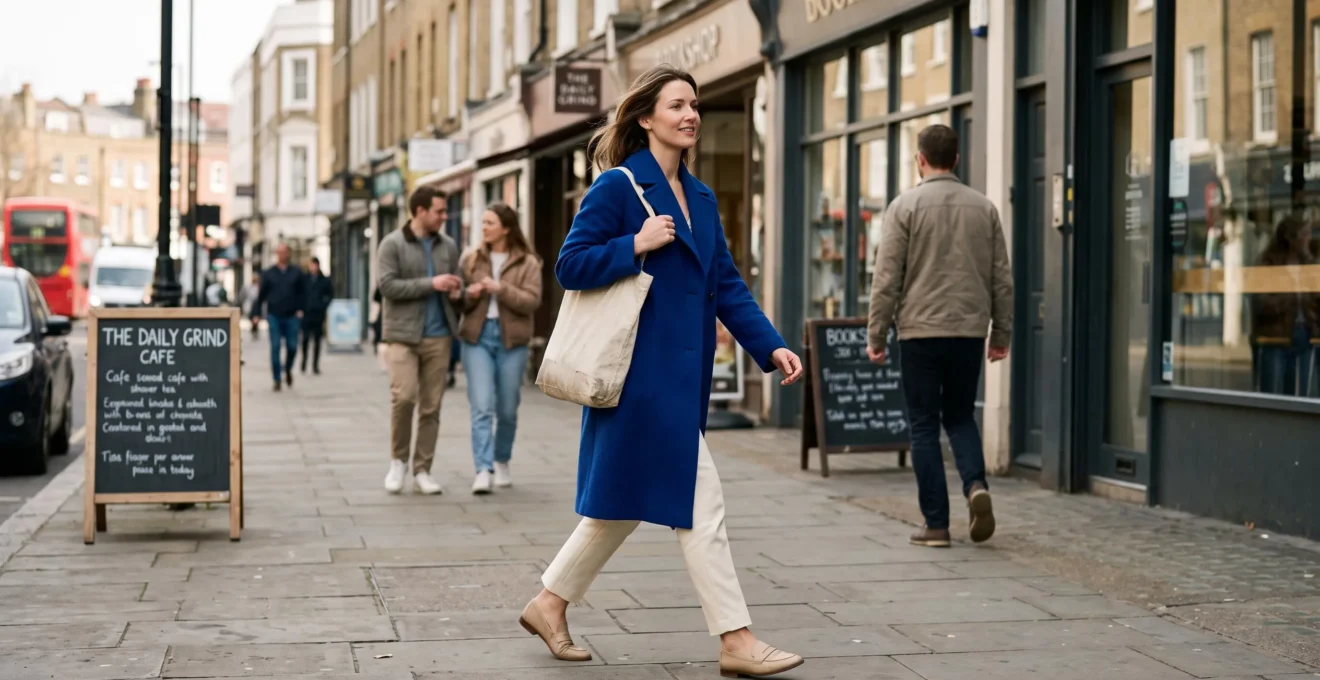
That cobalt jacket looks fantastic in your bedroom mirror. Then you step outside, notice everyone wearing navy, grey and beige, and suddenly wonder whether your outfit is too noticeable. The colour hasn’t changed. Your awareness of wearing it has.
Wearing vibrant hues confidently doesn’t require becoming an extrovert or committing to head-to-toe colour. The most approachable method is to choose one shade you genuinely enjoy, give it a clear role in your outfit and surround it with pieces that already feel familiar. A cobalt knit with stone trousers, cherry-red shoes with denim or an emerald shirt beneath a relaxed blazer can look expressive without appearing theatrical.
The challenge is partly visual and partly social. Contrast, fabric, daylight and occasion all influence how striking a colour looks. So does the expectation that other people will notice it. By adjusting both the styling and the situation in which you first wear something bright, you can make vibrant clothing feel like an extension of your everyday wardrobe rather than a performance.
How to wear bright colours without feeling overexposed
- Begin with one focal point: introduce a vivid accessory or garment against familiar neutrals before attempting several bright pieces together.
- Control the contrast: cream, camel, soft grey and denim can produce a gentler overall impression than automatically pairing every saturated shade with pure black.
- Dress for the occasion: adapt the size, placement and intensity of your colour to daylight, workplace expectations and your personal comfort.
- Why Do Vibrant Colours Feel So Exposed in Public Even When You Like Them in the Mirror?
- How to Start Wearing Bright Colours Using the 10% Rule Without Feeling Like a Spotlight
- Which Is Easier to Pull Off: Colour-Blocking or a Single Pop of Bright Colour for Work?
- The Neutral Pairing Mistake That Makes Bright Colours Look Harsh and Unflattering
- When Should You Wear Vibrant Hues to Look Energised Without Feeling Overdressed?
- How to Build a 5-Colour Wardrobe Palette That Creates 20 Outfits Without Feeling Boring
- How to Add One Streetwear Piece to a Smart Outfit Without Losing Credibility at Dinner
- How Can You Wear Streetwear as an Adult Without Looking Like You’re Trying Too Hard?
Why Do Vibrant Colours Feel So Exposed in Public Even When You Like Them in the Mirror?
Vibrant colours can feel more exposing in public because an outfit changes from a private aesthetic choice into something other people might notice. In the mirror, you judge whether the colour suits you. Outside, you may start imagining how strangers interpret it. That shift in attention can create discomfort even when the clothes themselves look exactly right.
At home, your surroundings are predictable. You control the lighting, the mirror and how long you examine your outfit. In a busy street or office, you encounter people whose reactions you cannot predict. A bright orange jacket may suddenly feel less like clothing and more like an announcement.
Psychologists have documented a related cognitive tendency called the spotlight effect. In a study of the spotlight effect published in the Journal of Personality and Social Psychology, Thomas Gilovich and colleagues found that people could overestimate how much others noticed their appearance and behaviour.
The experiments included participants wearing T-shirts with noticeable images. They did not specifically investigate saturated clothing colours, so they cannot establish how much attention a bright outfit will receive. However, the underlying distinction is useful: feeling conspicuous is not the same as being closely observed.
A practical way to examine that difference is to wear one colourful piece during an ordinary outing and record what actually happens. Before leaving, write down what you expect: perhaps three comments, a few looks or an awkward conversation. Afterwards, distinguish observable reactions from assumptions about what passersby were thinking.
Repeat the exercise across several outings if it feels useful. Some people may notice the colour; others may not. The aim isn’t to prove nobody looks, but to discover whether the attention is as consequential as you anticipated.
There’s also a difference between a colour that feels personally expressive and one you’re wearing purely because it’s fashionable. Someone who naturally gravitates towards emerald green may feel more at ease in an emerald jumper than in a trendy fluorescent pink coat, regardless of which is objectively more noticeable.
Once the concern becomes more specific, the next decision is smaller: how much colour would feel interesting without making the entire outfit unfamiliar?
How to Start Wearing Bright Colours Using the 10% Rule Without Feeling Like a Spotlight
The 10% rule is a simple styling exercise: make roughly one small part of your outfit colourful while keeping the rest familiar. Start with shoes, a scarf, a belt or a bag, then gradually experiment with larger garments as your comfort grows. The percentage is a practical visual guideline, not a scientifically validated measurement.
For example, a bright raspberry scarf against a cream shirt and beige trousers provides one obvious focal point. The surrounding pieces remain familiar, so the outfit doesn’t demand that you reconsider every element of your personal style.
This approach also reduces uncertainty about coordination. When there’s only one saturated accessory, you don’t need to manage the relationship between several competing colours.
Where you position the accent matters. Bright earrings or a scarf draw attention towards your face, making colour an intentional feature of your upper silhouette. A vivid handbag or pair of shoes introduces the same idea farther from your face, which may feel less personally exposing.
Choose the location that suits your comfort rather than assuming one is universally more flattering. Someone who enjoys expressive makeup might welcome a fuchsia scarf, while someone experimenting with their first colourful outfit may prefer cobalt trainers.
The underlying progression can be applied without buying anything new:
- Small accent: one colourful accessory in an otherwise familiar outfit.
- Medium accent: a brightly coloured top beneath a neutral jacket or cardigan.
- Main garment: colourful trousers, a coat or a dress supported by restrained accessories.
The general idea of becoming more comfortable through manageable experiences has parallels with behavioural approaches to anxiety. However, ordinary styling experiments are not clinical exposure therapy, and no particular clothing progression is established as a psychological treatment.
Your five-step colour-confidence starter checklist
- Choose one colour you genuinely like. Write its name down or save a photo of a garment you already own in that shade.
- Build one neutral outfit. Lay out the complete combination and take a reference photograph.
- Add one colourful accent. Photograph the revised outfit so you can compare it with the neutral version.
- Wear it on an ordinary outing. Record your anticipated reactions beforehand and actual observations afterwards in two short notes.
- Plan the next variation. Save one outfit idea featuring either the same accent or a slightly larger colourful garment.
Confidence doesn’t have to arrive before you wear colour. Familiarity can develop through wearing it, and eventually a bright accent may feel as ordinary as your favourite denim.
Which Is Easier to Pull Off: Colour-Blocking or a Single Pop of Bright Colour for Work?
A single pop of bright colour is usually easier to style for work because it can sit within an established professional wardrobe without changing the outfit’s overall formality. Colour-blocking creates a stronger visual statement and demands more coordination. Both can work, but your dress code, styling experience and comfort with attention should guide the choice.
A single accent might be a cherry-red blouse beneath a navy suit, an emerald tie with charcoal tailoring or cobalt shoes worn with a beige outfit. In each case, the conventional pieces establish the professional context while the colour adds personality.
Colour-blocking uses two or more distinct areas of colour. A cobalt top with orange trousers, for example, makes the relationship between those shades a major part of the outfit.
Traditional colour theory provides a useful starting vocabulary. Complementary colours, such as blue and orange, produce pronounced contrast. Analogous colours, such as blue and green, sit near each other on the colour wheel and often create a more cohesive impression. These relationships are explained in Adobe’s explanation of colour-wheel harmonies.
Neither combination is automatically appropriate for every workplace. Fabric, silhouette and the amount of each colour matter just as much as the relationship between their hues.
A practical comparison helps identify the easier option for your situation.
| Consideration | Single bright accent | Colour-blocking |
|---|---|---|
| Formal workplace | Generally easier to integrate discreetly | Requires closer attention to established dress expectations |
| Business casual | Simple and versatile | Possible with restrained proportions and polished garments |
| Creative workplace | Understated personal expression | Greater room for a distinctive visual signature |
| Styling experience | One main colour decision | Several colour and proportion decisions |
| Risk of feeling conspicuous | Usually easier to control | Potentially higher because multiple garments attract attention |
Colour-blocking isn’t inherently less professional. A well-fitted cobalt suit with a contrasting muted pink shirt can look considered in a creative office. Conversely, a vivid accessory can appear out of place if its material or design clashes with an otherwise formal outfit.
The safest transition is practical rather than theoretical. Wear one bright accent for a few weeks, then test a two-colour combination during a weekend lunch or informal social event. If the result feels natural, adapt it for an appropriate working day.
Start with colour placement, then explore colour relationships. That gives you an opportunity to develop confidence and coordination skills separately.
Whichever option you favour, the surrounding neutrals determine whether bright colour looks integrated, understated or deliberately high contrast.
The Neutral Pairing Mistake That Makes Bright Colours Look Harsh and Unflattering
The most common styling trap is treating black as the automatic partner for every bright colour. Black can create striking contrast, but that contrast may feel harsher than intended, particularly in daylight. Softer neutrals such as cream, camel, light grey or faded denim can make the same vivid garment look more integrated without removing its personality.
Imagine a cherry-red top beneath a pure black blazer. Both garments have clearly defined visual weight, and the combination can appear dramatic. Replace the black with a camel cardigan and the overall impression becomes warmer and less sharply divided.
This isn’t evidence that black is inherently unflattering. Black may be exactly the right choice for a graphic, contemporary outfit. The mistake is using it automatically when the desired effect is softness.
Think of neutrals as a way to adjust visual intensity. They aren’t merely an empty background for brighter garments.
- Off-white and cream: useful for lightening the overall impression of coral, cobalt, green or red.
- Beige and camel: often create a warm, relaxed effect alongside tomato red, orange or rich green.
- Light grey: can produce a cooler, more restrained combination with fuchsia, electric blue or violet.
- Denim: introduces familiar colour variation and casual texture that can make bold garments feel less formal.
- Pure black: increases graphic contrast, which is useful when drama is intentional.
Colour temperature offers another way to refine combinations. Warm-toned shades such as coral or burnt orange can look harmonious alongside cream and warm brown. Cooler pinks and blues may work naturally with grey and crisp white.
These are starting points rather than mandatory rules. A warm-and-cool pairing can be beautiful when the contrast feels intentional. The goal is to look at the outfit as a whole instead of following a rigid matching formula.
Fabric texture changes the impression too. A bright satin blouse beside a glossy black jacket produces a different result from the same blouse beneath a matte wool cardigan. Linen, cotton, wool and denim introduce surface variation, making an outfit feel less uniformly glossy or sharp. That is a styling observation, not a proven effect on colour saturation.
When a combination feels overly intense, change the neutral before abandoning the bright garment. You may discover that the colour itself was never the problem.
Once you know how to adjust contrast, you can apply the same judgement to different occasions rather than restricting vibrant clothes to evenings or special events.
When Should You Wear Vibrant Hues to Look Energised Without Feeling Overdressed?
Vibrant hues can work during the day, at social events and in many professional settings when their intensity matches the occasion. A colourful coat may feel natural at a weekend café, while a bright scarf is often easier to incorporate into a conservative meeting. The aim is to coordinate colour with formality rather than reserving all expressive clothing for evenings.
Context changes how people interpret an outfit. A cobalt knit with straight-leg jeans belongs comfortably in many casual environments. The same shade in a precisely tailored suit makes a stronger statement, especially where dark conventional tailoring is expected.
For everyday decisions, consider three broad categories:
- Informal and social occasions: relaxed lunches, shopping, daytime celebrations and casual gatherings generally offer room to experiment with larger areas of bright colour.
- Creative and business-casual environments: a colourful blouse, knit, jacket or refined colour-blocked combination may suit the setting when the garments remain appropriate to the dress code.
- Formal or ceremonial occasions: interviews, conservative business meetings and events with specific dress expectations may call for a smaller accent or a more restrained shade.
These are practical guidelines, not universal cultural rules. A wedding’s stated dress code, a workplace’s policies or the conventions of a particular event should take precedence over generic outfit advice.
Daylight adds another consideration. Bright natural light makes colour relationships easier to inspect and can reveal saturation that appeared more subdued under warm indoor lighting. A fluorescent lime top may look especially assertive outdoors, whereas deep emerald, cobalt or cherry red can offer substantial colour without the visual character of neon.
That doesn’t mean neon is unsuitable for daylight. It can be an intentional choice for summer outings, casual streetwear or outdoor activities. What matters is whether the effect matches your comfort and the occasion.
Evening lighting changes the experience again. Artificial illumination may soften, warm or alter the apparent tone of clothing, while darker surroundings can create a different level of contrast. Check outfits in the lighting where they’ll actually be worn rather than relying entirely on your bedroom mirror.
An effective daylight formula is one saturated garment, relaxed proportions and understated accessories. For example, an emerald shirt, stone trousers and brown loafers can appear energetic without relying on excessive contrast or decorative details.
Rather than preparing a completely different colourful outfit for every situation, you can build a small coordinated wardrobe that makes these decisions almost automatic.
How to Build a 5-Colour Wardrobe Palette That Creates 20 Outfits Without Feeling Boring
A five-colour wardrobe palette becomes versatile when it combines two or three dependable neutrals with one or two signature colours. Twenty outfits are possible with the right selection of interchangeable garments, although five colours alone cannot guarantee that number. The real advantage is having enough coordination between pieces that vibrant clothing becomes easy to wear repeatedly.
Start with your existing wardrobe instead of selecting an ideal palette from a colour chart. Identify which neutral trousers, jackets, shirts and shoes you wear most. Those pieces reveal the foundation you actually enjoy.
Then choose a vivid shade you already feel drawn towards. Perhaps friends regularly compliment your green jumper, or you instinctively pick cobalt whenever you shop. That existing preference is a stronger starting point than a colour trend you feel obliged to follow.
For an illustrative five-colour palette, consider cream, charcoal, denim blue, cobalt and cherry red. The first three create a familiar foundation; the final two provide different levels of colourful expression. Denim blue can function as a practical neutral here even though it is technically a hue.
To see how the outfit count works, imagine the following hypothetical capsule:
| Category | Pieces | Colours |
|---|---|---|
| Tops | 5 | Cream, charcoal, denim blue, cobalt, cherry red |
| Bottoms | 2 | Charcoal, denim blue |
| Outer layers | 2 | Cream, charcoal |
In this hypothetical selection, five tops can be combined with two bottoms to create 10 basic pairings. If either of the two outer layers can be added to every pairing, the capsule offers 20 layered combinations. Other outfit variations may also be possible.
This is a counting illustration, not a guarantee of 20 successful looks. Fit, weather, fabric weight, dress codes and personal taste determine whether particular combinations are practical. Some pairings may technically be possible but visually unappealing.
The simplest way to preserve versatility is to apply a three-outfit test before buying a new bright piece. Picture it with at least three outfits you already wear. If you cannot identify three convincing combinations, consider whether it would become an isolated purchase that requires more clothes to support it.
A restricted palette doesn’t have to mean repetitive styling. A cobalt cotton T-shirt, a cobalt wool jumper and a cobalt tailored jacket share a colour but differ in silhouette, texture and occasion. Wide-leg trousers, structured shirts and relaxed knits provide further variety without expanding the number of colours.
If you enjoy changing accents seasonally, you can temporarily substitute one signature shade. For example, a bright coral piece might replace cherry red during warmer months rather than becoming an additional permanent colour category.
That same principle—one expressive element supported by reliable basics—also works when the colourful piece comes from streetwear rather than conventional tailoring.
How to Add One Streetwear Piece to a Smart Outfit Without Losing Credibility at Dinner
To introduce streetwear into a smart dinner outfit, choose one deliberately casual piece and keep the remaining garments polished. Clean leather trainers, a plain heavyweight sweatshirt or a restrained bomber jacket can create a contemporary contrast with tailoring. A bright colour works particularly well when that streetwear element provides the outfit’s only obvious accent.
The balance matters more than the label. Dark tailored trousers, a crisp shirt and a charcoal blazer create a recognisably smart foundation. Add orange leather trainers and the colourful shoes become a considered contrast rather than a reason to rebuild the whole outfit.
Introduce several casual or attention-grabbing elements at once, however, and the outfit’s overall message changes. A large-logo hoodie, distressed jeans, chunky trainers and multiple decorative accessories may be perfectly appropriate for casual socialising, but they create a different impression from one refined accent at a smart restaurant.
The compatibility of streetwear pieces varies by occasion:
- Minimal leather trainers: relatively easy to combine with relaxed tailoring where smart-casual footwear is welcome.
- Plain crewneck sweatshirt: useful beneath an unstructured blazer if its fit and fabric look deliberate.
- Simple bomber jacket: can replace a conventional outer layer at informal dinners.
- Oversized logo hoodie: a more obviously casual choice that may feel out of place at formal venues.
The restaurant’s expectations still matter. Even understated trainers are unsuitable where a dress code explicitly requires formal shoes.
Streetwear can be a useful entry point for people who feel uncomfortable in traditionally dressy bright clothing. Cobalt trainers or a cherry-red sweatshirt already belong to a visual language associated with relaxed everyday dressing. That familiarity may make the colour easier to incorporate than a similarly vivid formal jacket.
A 2014 study published in PLOS ONE, the PLOS ONE study on colour coordination and fashionableness, found that outfits tended to receive favourable fashionability judgments when their colours balanced coordination and variation rather than being excessively matched or mismatched.
The research did not evaluate streetwear at restaurants, so it shouldn’t be treated as proof of any particular dinner outfit formula. It does reinforce the broader value of considering how visual elements relate to one another.
Details help maintain that relationship. Clean footwear, properly fitting trousers and well-maintained outerwear give a colourful casual accent an intentional place in the outfit. A simple silhouette prevents the bright piece from competing with oversized logos, excessive detailing or several unrelated trends.
That principle extends beyond dinner dressing. It also provides a useful answer to the concern that adult streetwear—or any brightly coloured casual garment—might look like an effort to appear younger.
Key takeaways before building your everyday style
- Judge a colourful streetwear piece by its fit, fabric and compatibility with your usual clothes, not by whether someone your age is expected to wear it.
- Choose the one element that deserves attention instead of combining several competing trend signals.
- Keep enough familiar pieces in your outfit that the colour feels like an expression of personal taste rather than a completely new identity.
How Can You Wear Streetwear as an Adult Without Looking Like You’re Trying Too Hard?
Adults can wear streetwear naturally by prioritising fit, simple designs and a small number of expressive pieces rather than combining every current trend. A bright sweatshirt, clean trainers or minimal bomber can work at almost any adult age when it suits the person’s proportions and the occasion. The goal is consistency with your own style, not dressing according to an arbitrary age limit.
The impression of trying too hard often comes from stacking visual signals. A conspicuous logo, fashionable trainers, statement jewellery, an oversized silhouette and several bright colours may each work individually. Together, they can compete for attention and leave the outfit without a clear visual centre.
Instead, make one decision deliberately. If your favourite piece is an orange heavyweight hoodie, wear it with straightforward charcoal trousers and restrained footwear. If the focal point is a vivid green bomber jacket, let a plain shirt and familiar denim provide the foundation.
Age isn’t the most useful styling filter. Someone in their fifties can look comfortable in a beautifully fitting cobalt sweatshirt, while someone in their twenties may feel awkward in an oversized trend-led outfit that doesn’t reflect their taste. Proportion, material, setting and personal identity provide more practical guidance than chronological age.
There is also a difference between wearing an identifiable streetwear garment and adopting every associated styling convention. You can enjoy a hoodie without pairing it with oversized cargo trousers. You can appreciate colourful trainers without adding multiple logos or technical accessories.
For long-term versatility, prioritise garments that have a useful role beyond the current trend. A plain, substantial cotton sweatshirt is easier to combine with a compact wardrobe than a piece whose main feature is a conspicuous seasonal graphic. A simple bomber in a signature colour can be worn repeatedly with jeans, chinos or relaxed tailoring.
Most importantly, streetwear offers a legitimate way to wear vibrant hues without turning the entire outfit into a fashion statement. Its casual associations can make a brightly coloured piece feel familiar and approachable. You can keep the colour and ignore any styling conventions that don’t appeal to you.
For your next outfit, choose one colourful garment you already own, pair it with two familiar pieces and wear it during a normal daytime activity. Afterwards, decide what you actually liked about the combination. Keep what feels authentic, adjust what doesn’t and allow your everyday wardrobe to evolve through use rather than through pressure to make a dramatic change.
Can you wear bright colours if you prefer not to attract attention?
Yes. Choose one colourful piece that feels personally appealing, then use familiar neutrals, uncomplicated silhouettes and understated accessories to moderate the overall impression. Bright clothing may still attract occasional attention, but wearing colour doesn’t require welcoming or seeking that attention.
Are some bright colours more flattering than others?
How flattering a colour appears depends on individual complexion, lighting, surrounding colours and personal preference. Rather than assuming a universal rule, compare different shades near your face in natural light. If a vibrant colour feels overwhelming, try a slightly deeper or softer version, or move it to an accessory farther from your face.
Can you combine two vibrant colours without looking mismatched?
Yes. Two saturated colours can work together when their proportions, temperature and relationship feel deliberate. Try a larger area of cobalt with a smaller orange accent, or combine neighbouring shades such as blue and green. A restrained silhouette and simple accessories help keep the overall outfit coherent.
What should you do if someone comments negatively on a colourful outfit?
Consider whether the comment offers genuinely useful information, such as a relevant dress-code concern, or simply reflects another person’s preference. You don’t need to defend a colour you enjoy. A brief, neutral response is enough, and one person’s reaction doesn’t establish whether the outfit works for you.
Do bright accessories need to match each other exactly?
No. Exact matching isn’t necessary for an intentional outfit. Accessories can share a general colour family, complement a dominant shade or remain neutral so that one colourful piece stands out. Repeating a specific hue can create cohesion, but forcing every item to match may make an outfit feel more coordinated than you want.