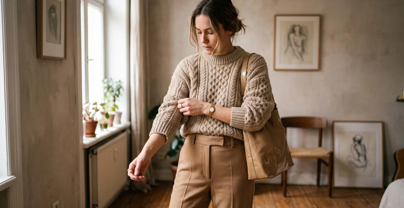
A plain beige sweater and matching trousers can look remarkably different depending on their surfaces. Pair a smooth cotton top with smooth cotton trousers, and the outfit may appear visually flat. Replace the top with a ribbed knit, or introduce a softly polished leather accessory, and the same neutral palette suddenly has more dimension.
The difference is fabric texture rather than additional colour. Ribbing creates small shadows, brushed wool softens reflected light, and satin introduces a controlled highlight. Together, these variations give the eye something to notice without requiring prints, bright accessories or complicated styling.
The practical approach is to combine one dominant fabric surface with one contrasting texture, considering the outfit’s silhouette, lighting and areas of friction. A minimalist wardrobe already containing denim, cotton, knitwear, wool and leather may offer plenty of combinations without another purchase.
Texture is not a substitute for good fit, clean finishing or suitable fabric quality. It is a way to make those existing qualities more visible.
The essential rules for polished texture styling
- Pair one dominant matte or textured fabric with one smaller contrasting surface instead of competing statement textures.
- Assess sheen and surface detail under the lighting where the outfit will actually be worn.
- Protect delicate fabrics from repeated rubbing, and use tonal variation sparingly to give monochrome looks more depth.
- Why Does Texture Make Outfits Look More Premium in Photos Even When the Pieces Are Basic ?
- How to Combine 2 Textures in One Outfit Without Looking Overstyled or “Busy” ?
- Which Looks Appropriate at Work: Matte Texture or Subtle Sheen When Lighting Is Harsh ?
- The Texture Pairing Mistake That Causes Pilling and Snags After 3 Wears
- A Texture Placement Trick That Helps Clothes Look Newer for 6 Months Longer
- Why Can the Same Outfit Look Premium Outdoors but Flat Under Office Lighting After 6 p.m. ?
- How to Add Depth to a Monochrome Outfit Using Texture, Sheen, and 2 Shades of the Same Colour
- How Can You Wear a Monochrome Outfit Without Looking Flat or Like You’re Wearing a Uniform ?
Why Does Texture Make Outfits Look More Premium in Photos Even When the Pieces Are Basic ?
Texture can make basic clothes appear more premium in photographs because an uneven fabric surface creates variations in light and shadow. Ribbing, visible weaves and brushed fibres introduce depth that a uniformly smooth surface may lack. The effect depends on lighting and image quality, however, and a textured appearance does not prove that a garment is expensive or well made.
Consider two hypothetical outfits in the same shade of charcoal. The first combines a smooth jersey T-shirt with plain trousers. The second replaces the T-shirt with a structured ribbed knit. In side lighting, the knit’s raised channels produce highlights and small shadows, making its construction easier to see.
That visual information can make a photograph appear more detailed and deliberate. It is a styling effect, not evidence that viewers universally associate textured fabrics with higher prices.
Brown University‘s textile photography documentation explains that photographing glossy, coarse or fluffy surfaces requires attention to how light reveals their characteristics. It also notes that diffuse lighting can diminish the appearance of metallic fibres. The lesson for clothing is that texture and illumination work together.
Photographs reveal only part of the story. A highly reflective synthetic fabric might produce an attractive image but feel flimsy or uncomfortable in person. Conversely, substantial cotton or softly brushed wool may look understated on screen while offering satisfying weight and movement.
When assessing a garment, look beyond its photograph:
- Touch: Does the surface feel pleasant and consistent rather than unexpectedly scratchy or stiff?
- Drape: Does the material fall naturally or distort around seams and folds?
- Construction: Are the stitching, edges and fabric surface reasonably even?
These observations are more useful than assuming that a pronounced texture automatically signals luxury. Material assessment can also be technical: NC State University‘s Kawabata textile evaluation documentation describes measurable properties including bending rigidity, shear stiffness, surface friction and roughness.
The simplest wardrobe upgrade may therefore be to wear an existing textured sweater with smooth trousers rather than replacing either piece with a more colourful alternative.
Once texture has a clear visual role, the next question is how much contrast an outfit can accommodate without becoming distracting.
How to Combine 2 Textures in One Outfit Without Looking Overstyled or “Busy” ?
Combine two textures by giving one the main visual role and using the other as a controlled accent. A chunky knit sweater with smooth trousers, or a matte dress with a polished leather bag, creates a readable contrast. Keeping the second texture smaller or quieter helps the silhouette remain the focus instead of making every surface compete for attention.
Start with the garment covering the largest visible area. This becomes the dominant texture. Then choose one accent that differs in a clear, noticeable way.
For example, imagine cream tailored trousers and a textured oatmeal sweater. A small smooth leather handbag creates enough contrast to define the outfit. Adding a heavily embroidered jacket, glossy scarf and patterned shoes could introduce several competing focal points.
A useful styling heuristic is to change just one main texture dimension at a time.
| Contrast dimension | Dominant surface | Accent surface |
|---|---|---|
| Matte versus sheen | Matte wool trousers | Softly polished leather belt |
| Rough versus smooth | Chunky cotton knit | Smooth tailored trousers |
| Structured versus fluid | Structured denim jacket | Fluid fine-knit top |
This is a practical composition rule rather than a scientifically established maximum for texture combinations. Experienced dressers can mix several contrasts successfully, especially when shapes and colours remain restrained.
Not every unsuccessful combination contains excessive contrast. Two very similar fine knits can create a different problem: their rib sizes or surface finishes may look accidentally mismatched rather than intentionally coordinated.
If neither fabric clearly dominates or contrasts with the other, replace one with a smoother material or introduce a more distinct structure.
The final check is visual distance. Stand a few steps away from a mirror or take a full-length photograph. If surface details dominate your first impression and the silhouette becomes difficult to read, reduce the more noticeable texture or confine it to an accessory.
Successful contrast should look intentional without demanding attention. The same principle becomes especially useful when choosing clothes for workplaces with challenging lighting.
Which Looks Appropriate at Work: Matte Texture or Subtle Sheen When Lighting Is Harsh ?
Matte fabrics are often the more predictable choice under harsh overhead office lighting because they tend to produce fewer concentrated reflections than glossy surfaces. Subtle sheen can still look professional when its highlights remain controlled. The better option depends on the specific fabric, the direction and strength of the lighting, and the workplace’s dress expectations.
Bright directional illumination can create prominent highlights on satin, polished synthetics and some silky blends. Under certain ceiling lights, a glossy blouse may develop bright patches across the shoulders or upper chest while the rest of the garment appears much darker.
Matte crepe, ponte, brushed cotton and many wool weaves generally provide a quieter appearance. They can also display structure through their weave or drape without relying on strong reflections.
For a restrained work outfit, try matte or softly textured fabric near the face and shoulders, with subtle sheen concentrated in a skirt, belt, handbag or another smaller area.
This is not an absolute rule. A finely woven twill blouse may look excellent beneath office lights, while an inexpensive matte material may still hang poorly. The fabric’s finish, construction and fit matter more than the label attached to its sheen level.
A useful distinction is between controlled light play and a mirror-like finish. Fine twill, faille and some gabardines can create modest directional highlights. Highly reflective satin is more visually assertive, although that does not automatically make it inappropriate for work.
Before wearing an unfamiliar fabric, inspect it under the actual ceiling lights. A phone flashlight can help reveal concentrated reflections, but its small, directional beam may exaggerate effects that would not appear under diffuse office lighting.
Evening settings call for another assessment. A softly reflective blouse may provide welcome dimension under warm restaurant lighting, while the same garment may dominate the outfit beneath bright conference-room lights.
The decisive factor is where the outfit spends most of its time, not a universal hierarchy that places matte above sheen.
Once the visual balance is right, consider how the fabrics interact physically. An elegant pairing can lose its appearance quickly when delicate surfaces repeatedly rub against rougher ones.
The Texture Pairing Mistake That Causes Pilling and Snags After 3 Wears
A potentially damaging texture pairing places a rough or abrasive surface directly against a delicate fabric during repeated movement. Coarse knits can catch loose threads, while friction can contribute to fuzzing and pilling. Damage is not guaranteed after three wears: its timing depends on fibre composition, fabric construction, contact pressure, laundering and how frequently the garments are used together.
Imagine wearing a loosely woven satin-effect skirt beneath a coarse wool cardigan. If the cardigan repeatedly rubs against the skirt at hip level, the delicate surface may experience catching or abrasion. A similar problem can occur when a textured handbag repeatedly brushes against an open-knit sweater.
Abrasion and pilling are related but distinct. Abrasion involves surface deterioration through friction. Pilling refers to small, entangled fibre balls remaining attached to the textile. Snagging happens when fibres or threads catch and are pulled from their intended position.
Cotton Incorporated‘s garment durability resource explains that abrasion can occur through contact with the same fabric or another material. It also describes how fibre characteristics, yarn and fabric construction, finishing and use affect pilling.
These mechanisms explain why texture compatibility matters, but they do not establish that any specific wool-and-satin combination will fail after a predetermined number of wears.
A gentle compatibility check may reveal obvious catching before two garments are worn together. If suitable spare swatches are available, lightly bring their surfaces together and check for snagging or loose fibre transfer. Avoid aggressively rubbing finished garments, particularly silk, delicate knits or loosely woven fabrics.
This informal check is not a validated predictor of long-term wear. Professional textile abrasion and pilling assessments use controlled methods, so the absence of immediate catching offers no durability guarantee.
If two fabrics seem incompatible, preserve their visual contrast without forcing contact. Wear a smooth layer between them, choose a lined garment, or carry a structured bag away from the delicate knit surface.
For minimalists, protecting a garment’s surface has an aesthetic benefit: bobbles, pulls and flattened fibres can undermine the carefully maintained contrast that originally made the outfit attractive.
Preventing contact damage is often easier than restoring a fabric after it has deteriorated. That makes texture placement a useful consideration when building everyday outfits.
A Texture Placement Trick That Helps Clothes Look Newer for 6 Months Longer
Place delicate or pronounced textures where they experience relatively little repeated rubbing, and use smoother, more durable surfaces in high-contact areas. This can help preserve the appearance of knit relief, raised weaves and soft finishes. It may keep garments looking newer for longer, but six additional months is not an established or guaranteed result.
The key is to consider how a garment moves through an ordinary day. A shoulder bag repeatedly contacts the side of a sweater. A desk rubs against forearms. Seatbelts cross particular sections of a jacket, and sleeves may brush against a coat lining.
These interactions can contribute to wear, especially when surface fibres are vulnerable to repeated contact. Visible effects may include pilling, fuzzing, flattening and localised changes in appearance.
Instead of avoiding expressive textures, place them in lower-contact zones whenever the design allows.
- Shoulders: Choose relatively durable surfaces when regularly carrying a shoulder bag.
- Forearms: Consider smoother sleeve surfaces if working against a desk throughout the day.
- Accessories: Keep delicate knits away from rough bag straps, abrasive hardware or hook-and-loop fasteners.
- Decorative areas: Use textured hems, scarves or panels where they are less likely to experience constant friction.
A textured scarf can provide the same visual interest as a heavily textured sweater while avoiding some forms of contact, provided it does not repeatedly rub against rough outerwear. Similarly, a knit with textured detailing on the front may be less exposed to bag-strap abrasion than one with raised detailing across the shoulders.
Garment care reinforces this placement strategy. Follow the care label, minimise unnecessary washing, allow suitable garments to rest between wears, and remove pills only with a tool appropriate for the fabric. Rough brushing or aggressive depilling can cause additional damage.
During a wardrobe audit, inspect existing garments and record where they wear fastest. If several sweaters show damage near a handbag strap, change the bag placement or add a protective outer layer. If sleeve fronts repeatedly become fuzzy, reconsider delicate fabrics for desk-heavy days.
The six-month objective is best treated as a personal observation period. Track how frequently each item is worn, how it is cleaned and whether high-contact areas deteriorate. No fixed extension in appearance can be inferred for every garment.
Preserving texture maintains its visual effect, but even an immaculate fabric can appear flat when the lighting changes during the day.
Why Can the Same Outfit Look Premium Outdoors but Flat Under Office Lighting After 6 p.m. ?
An outfit can look dimensional outdoors and flatter under office lighting because the direction, intensity, diffusion and colour of illumination change how fabric surfaces are perceived. Raised textures need suitable light to reveal their relief, while sheen depends on visible reflections. The effect is not specific to 6 p.m., and natural light is not always better than artificial lighting.
Imagine a charcoal ribbed sweater photographed beside a large window. Gentle side lighting creates visible tonal variation between its raised ribs and recessed channels. Move the same sweater beneath broad, nearly frontal illumination, and those differences may become less apparent.
With strong directional overhead lighting, the opposite can happen. Shadows become more dramatic and shiny areas may develop pronounced highlights. The result depends on the fabric and light geometry rather than whether the source is natural or artificial.
University of California lighting guidance distinguishes concentrated hard light from softer illumination produced by larger light sources. It also explains that clear-sky sunlight can create hard shadows, whereas overcast conditions produce more diffuse light.
These principles help explain why morning photographs and evening mirror checks may produce different impressions. Camera exposure and white balance can exaggerate the discrepancy, especially when daylight and artificial light are mixed.
If an outfit loses definition indoors, introduce one texture with stronger visible relief. A ribbed cardigan, a pronounced twill weave or a carefully selected leather accessory may restore separation between otherwise similar garments.
Use sheen more cautiously under concentrated overhead lighting. Under dimmer, softer conditions, however, a small reflective element may help create a visible focal point.
This differs from assessing workplace appropriateness. The question here is whether a material’s texture remains visible, not whether the garment appears sufficiently formal.
A practical test is to photograph the same outfit in the actual environments where it will be worn. Keep the camera angle and distance reasonably consistent, then compare how clearly its fabrics and silhouette read.
Light reveals different aspects of a fabric, but carefully chosen tonal shades can add another dimension when a look depends on a single colour family.
How to Add Depth to a Monochrome Outfit Using Texture, Sheen, and 2 Shades of the Same Colour
Add depth to a monochrome outfit with three coordinated elements: a matte base, one contrasting fabric with controlled sheen or a distinct weave, and a small area in a second shade of the same colour. This creates surface, light and tonal variation without introducing another colour family. Keep the contrasts intentional so the outfit still reads as monochrome.
For a hypothetical grey outfit, start with matte charcoal trousers and a ribbed grey knit. Add a softly polished grey leather accessory, then introduce a slightly lighter grey scarf or underlayer. Each variation performs a different visual function.
The matte trousers establish a quiet base. Ribbing gives the upper half definition. The polished accessory reflects light differently, while the lighter grey creates a small tonal break.
The same approach works with cream, beige, navy, olive or brown, provided the shades remain recognisably related.
Choose the two tones by placing them side by side in daylight. A barely perceptible difference may look like an accidental mismatch, particularly when pieces meet along a clear seam or waistband. An excessively large difference can instead make the outfit look deliberately two-tone.
There is no universal numerical threshold for the ideal shade difference. The important test is whether both pieces remain visually connected while contributing distinct tonal information.
A common mistake is adding sheen to several garments simultaneously. Satin trousers, a glossy blouse, reflective shoes and a patent bag may compete for attention, especially when the rest of the outfit offers little matte contrast.
Instead, give one surface responsibility for light play. Let the other garments provide quieter texture, shape and structure.
This is more restrictive than the basic two-texture pairing method because monochrome styling offers less colour differentiation. When the palette remains constant, the eye relies more heavily on material differences and silhouette to understand the outfit.
Build a polished monochrome outfit from your existing wardrobe
- Select one colour family and lay out your available garments. Deliverable: a visible group of coordinating pieces.
- Choose a matte or low-sheen base garment. Deliverable: one clearly identified dominant surface.
- Add a contrasting knit, weave or subtly reflective accessory. Deliverable: one intentional texture focal point.
- Compare two shades of the same colour in daylight. Deliverable: a tonal pairing that looks deliberate rather than mismatched.
- Try the complete outfit in daylight and indoor lighting. Deliverable: two reference photographs showing whether the texture contrast remains visible.
The result should still feel simple. Texture, controlled reflection and tonal variation support the outfit’s overall shape rather than replacing it as the main point of interest.
Key takeaways before getting dressed
- If an outfit looks uniform, identify whether the problem is identical surfaces, an unvaried silhouette or insufficient tonal separation.
- Correct the most noticeable issue first rather than changing several garments simultaneously.
- Judge the finished combination under realistic lighting and check that delicate fabrics are not exposed to unnecessary friction.
How Can You Wear a Monochrome Outfit Without Looking Flat or Like You’re Wearing a Uniform ?
A monochrome outfit avoids looking flat when its garments offer enough variation in fabric surface, silhouette or tonal shade to create visual separation. Pairing structured trousers with a soft knit, for example, can distinguish the upper and lower halves without changing colour. Usually, one deliberate adjustment is more effective than adding several accessories.
The uniform effect often appears when an outfit repeats similar materials and shapes. A navy cotton T-shirt with navy cotton trousers can create a visually continuous block, particularly if both pieces have comparable weight and surface finish.
That does not make the combination inherently unattractive. An uninterrupted silhouette can look refined when its fit, proportions and construction are intentional. The problem arises when a wearer wants more definition but the garments provide few visible differences.
Start by diagnosing whether the flatness comes from texture or shape. A finely knitted top paired with tailored trousers may already have different surface structures, but both pieces might be equally close-fitting or equally loose. In that situation, adjusting the proportions may achieve more than adding another fabric finish.
The fastest fixes can be ranked by effort:
- Change one accessory: Introduce a leather belt, softly reflective bag or textured scarf already in the wardrobe.
- Swap one garment: Replace a smooth cotton top with a ribbed knit, or exchange plain trousers for a structured woven pair.
- Adjust the silhouette: Pair fluid fabric with a more tailored piece, or define the waist through proportion and fit.
- Introduce a tonal accent: Use two visibly related shades when texture alone does not create enough distinction.
For example, an all-black outfit can move from casual to more considered simply by combining a fine matte knit with structured wool trousers and a restrained leather accessory. The colour remains unchanged, but differences in drape and reflected light establish distinct areas.
A cream outfit might instead rely on an open-weave cardigan over a smooth cotton layer. Here, the visible weave creates depth without requiring sheen.
Before considering a new purchase, evaluate the full outfit through a simple decision path. First, check its appearance in the lighting where it will be worn. Next, decide whether it needs more texture contrast or better silhouette definition. Finally, make sure the chosen fabrics can coexist without repeated damaging contact.
For your next monochrome outfit, begin with two garments you already wear regularly. Photograph them together, swap just one texture, and compare the result under your usual lighting. Keep the version that feels most balanced, comfortable and practical rather than assuming the more elaborate combination must look more expensive.
Can inexpensive clothes look polished through texture alone?
Texture can make inexpensive basics look more visually considered when their surfaces contrast clearly and their fit is good. A ribbed sweater, smooth tailored trousers and restrained accessory can create depth without bright colours. However, texture cannot reliably disguise poor stitching, damaged material or badly proportioned garments.
Is a chunky knit always better than a fine knit for a minimalist wardrobe?
No. Chunky knits offer pronounced visual relief, while fine knits can provide a smoother, more understated appearance. Choose according to the outfit’s proportions, season and intended contrast. A fine knit may work especially well beside structured denim, brushed wool or another fabric with more visible surface detail.
Can smooth fabrics work together without making an outfit look flat?
Yes. Smooth fabrics can differ through their weight, structure, drape and reflection. Fluid trousers paired with a crisp cotton shirt may create enough contrast through silhouette alone. Texture is one useful styling tool, not a requirement for every polished outfit.
Do different shades of beige count as adding another colour?
Not necessarily. Cream, oatmeal, sand and camel can form a tonal outfit within a broadly related neutral family. Whether it appears monochrome depends on how closely the shades relate. For a stricter single-hue look, choose colours with similar undertones and use texture as the main source of variation.
How can delicate textured clothing be stored without flattening or snagging?
Follow the garment’s care instructions and consider folding knits that could stretch on hangers. Keep delicate weaves away from rough fasteners, sharp accessories and abrasive surfaces. Allow enough storage space to avoid unnecessary compression, and inspect textured pieces for pulls or pilling before wearing them again.